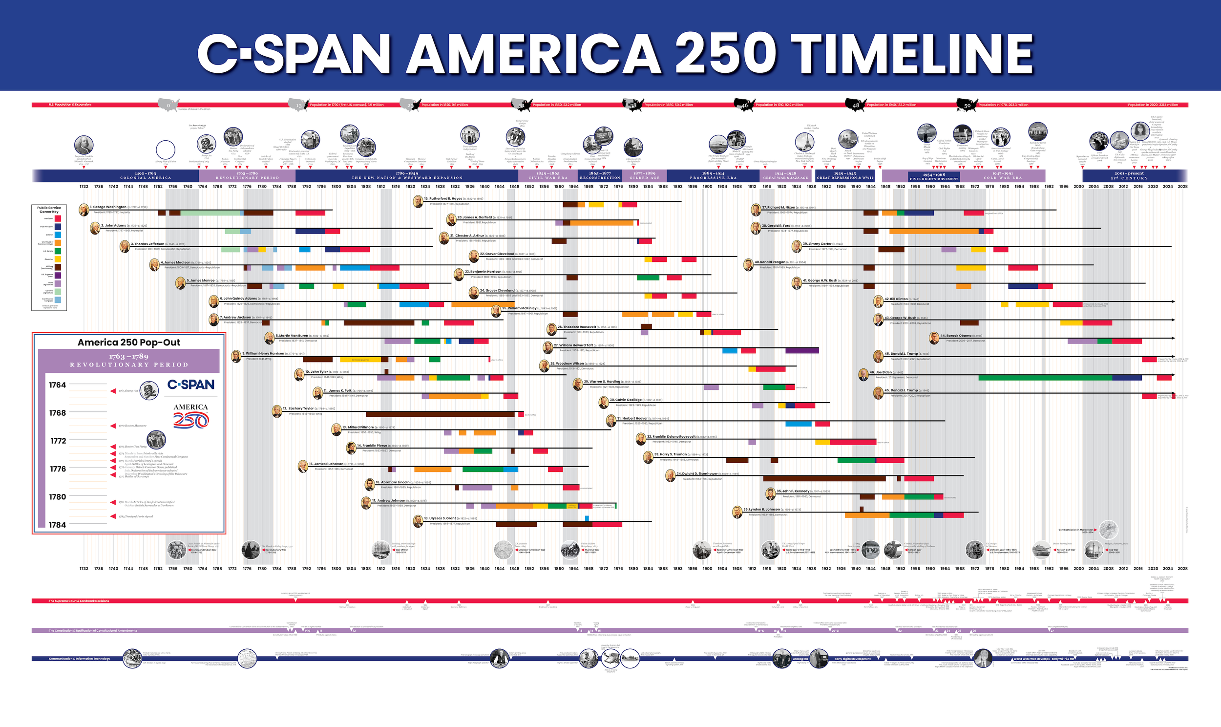
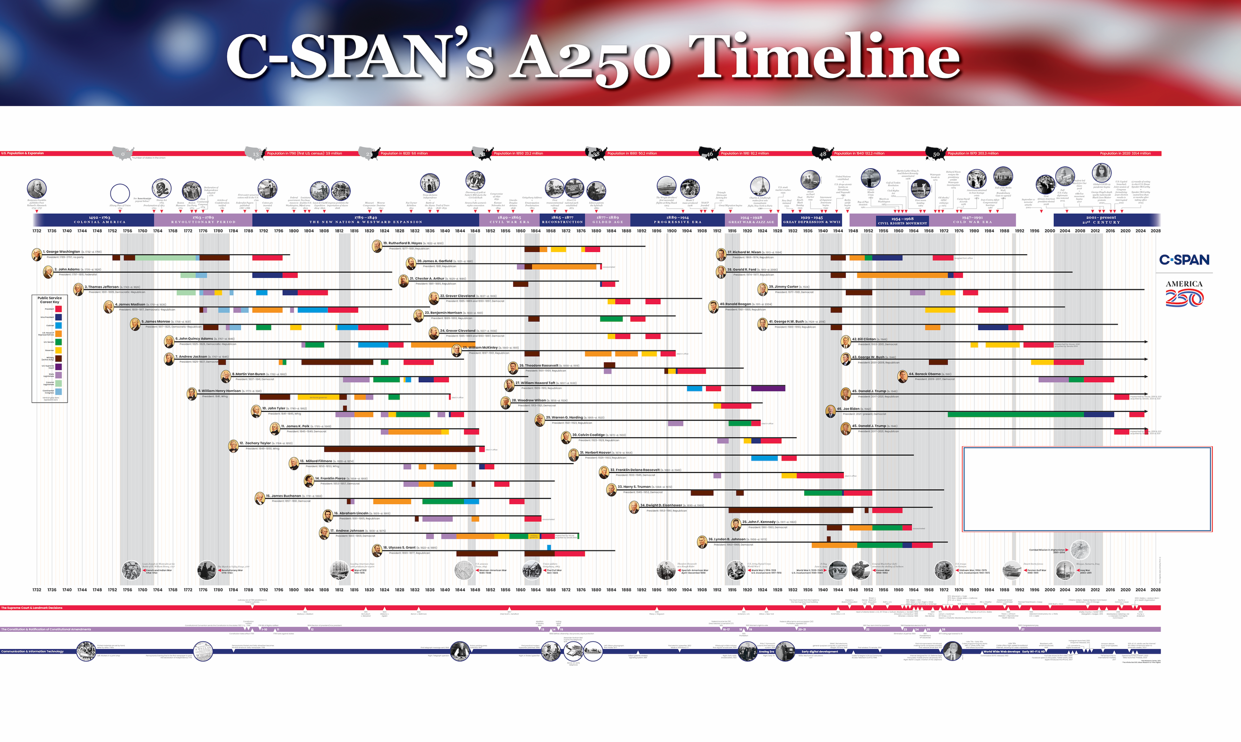
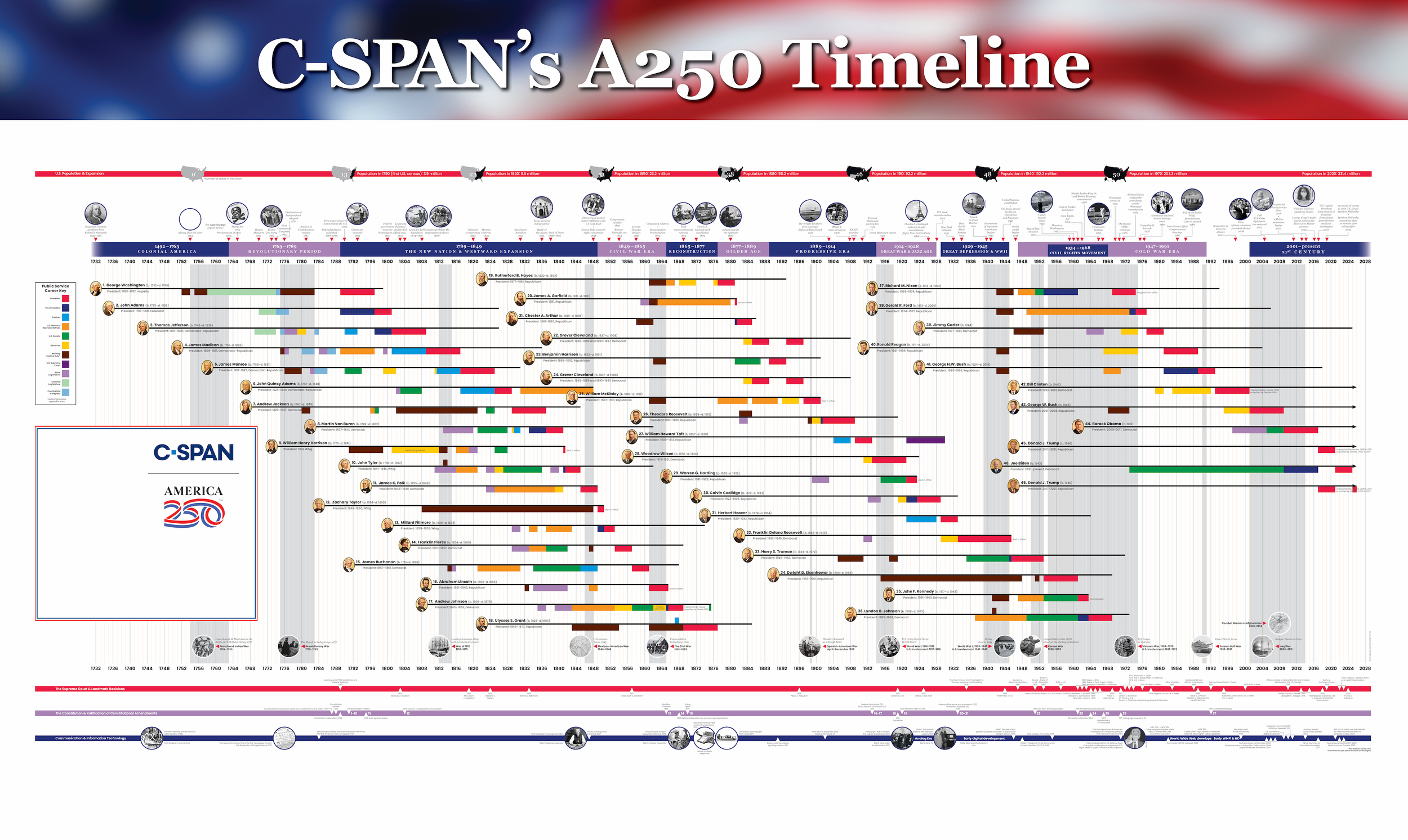
America 250 Timeline
In anticipation of the United States’ 250th anniversary, C-SPAN set out to update its existing American Presidents Timeline and expand it into a broader American History Timeline. The goal was to create a refreshed educational resource for classrooms that highlighted major moments in U.S. history while placing special emphasis on the Revolutionary era.
The final design was a large-format horizontal poster (55" × 33") distributed to educators across the country. Approximately 30,000 copies were printed and shipped free to teachers and institutions that requested one.
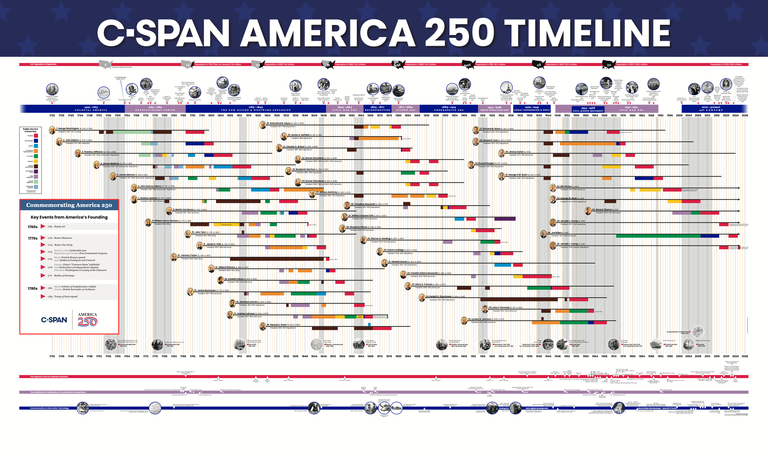
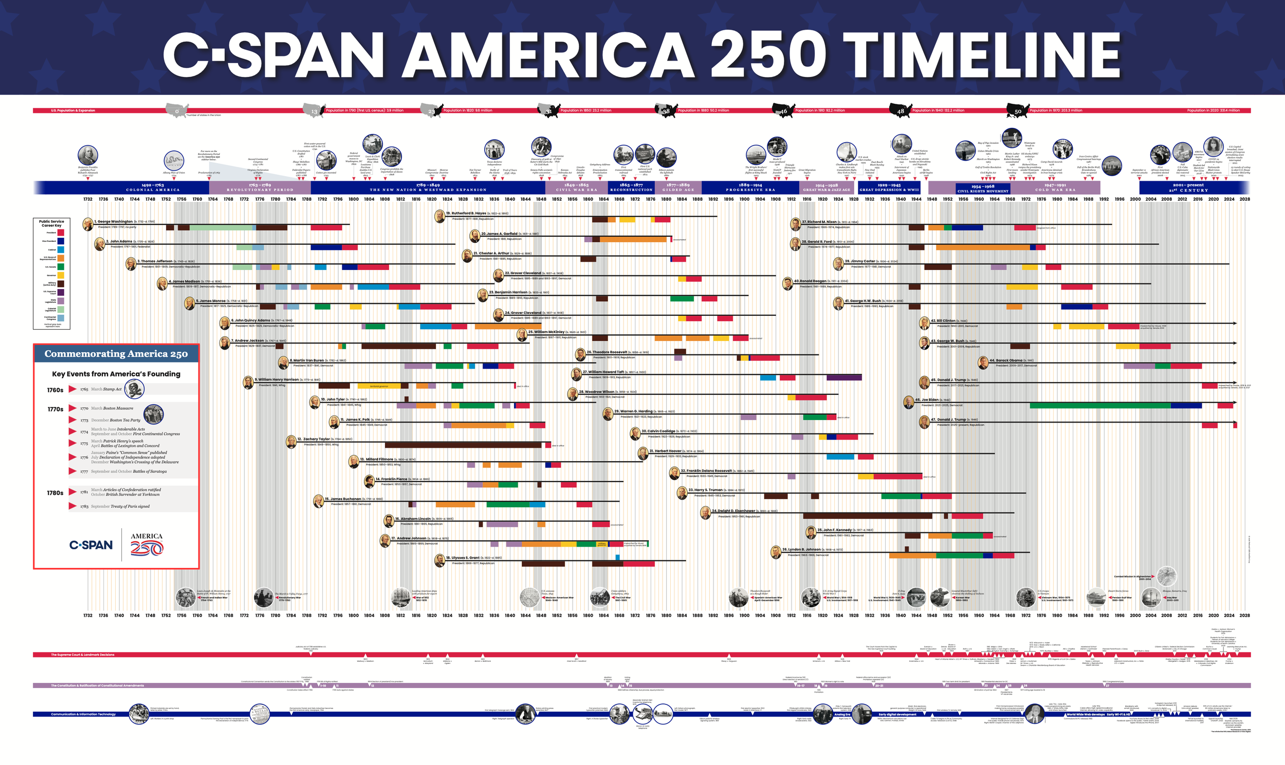
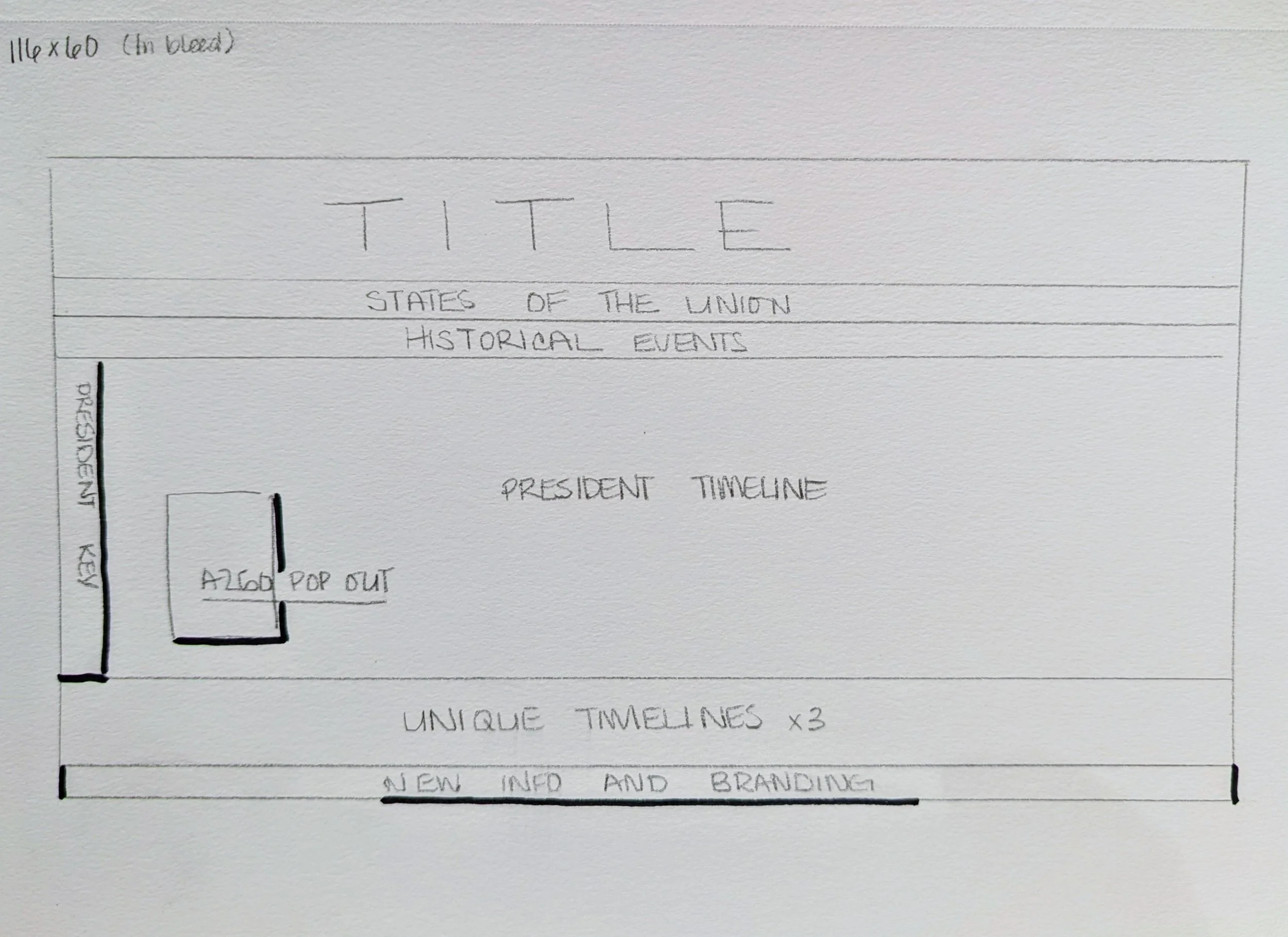
I served as the lead designer for the project, working primarily in Adobe InDesign to build and organize the full infographic layout. My primary design contribution was developing a dedicated sidebar highlighting key details about the nation’s 250th anniversary and the Revolutionary period. This section needed to feel visually distinct while still integrating smoothly with the broader timeline structure. Because the poster contains a large amount of historical information, careful hierarchy and spacing were essential to keep the content readable at scale.
This project required coordination across several departments at C-SPAN. I worked closely with my design supervisor, the Vice President of Marketing, and the Vice President of Education and his team.
Together we determined what historical information should be included, how it should be prioritized, and where it would appear within the layout. The marketing team then collaborated with us to ensure the final files were prepared correctly for large-scale printing and distribution.
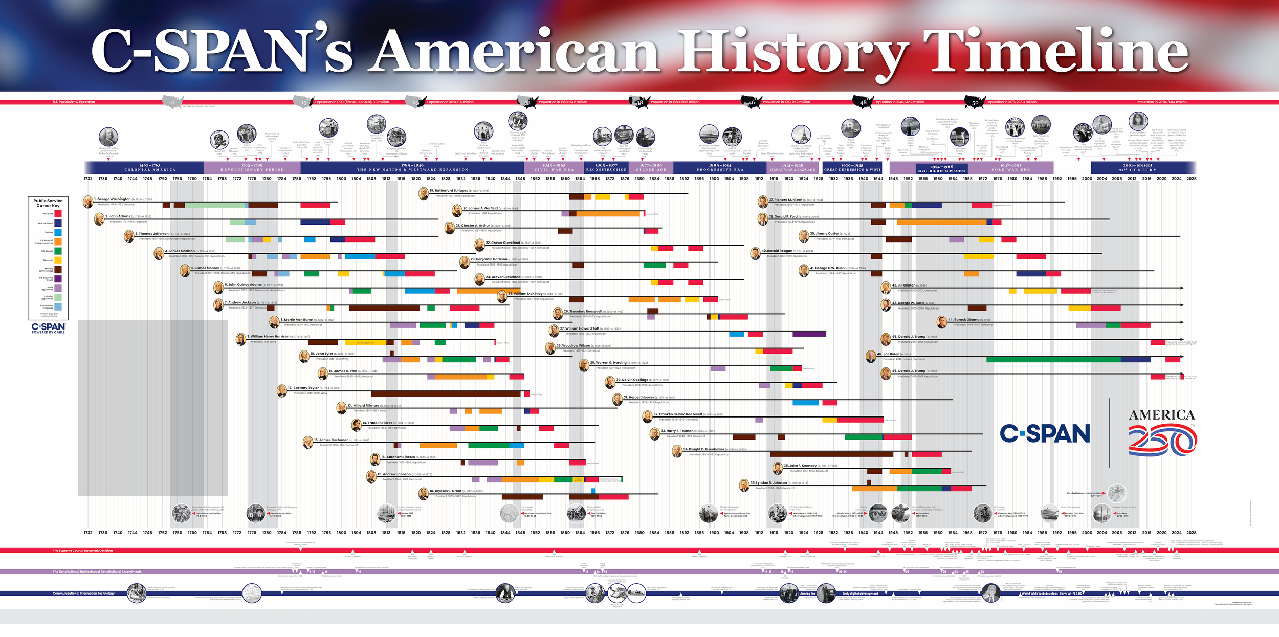
The project built upon a previous timeline released around the 2024 presidential election, but several updates were required to make the poster relevant for the 250th anniversary.
Key design challenges included:
Condensing the layout into a slightly smaller format than the previous version
Balancing dense information across a wide horizontal composition
Iterating on the sidebar placement so the anniversary content stood out without interrupting the timeline flow
Multiple rounds of feedback from the education and marketing teams helped refine the information hierarchy and determine which events ultimately made the final poster.
The finished infographic launched in 2026 with an initial print run of 30,000 copies. Based on demand for the previous timeline, the team anticipated the posters would be distributed quickly to educators nationwide, with a possible reprint depending on demand.
Designing a large-scale educational infographic reinforced how critical information hierarchy and spacing are when presenting complex historical material. The challenge was not just fitting the content onto the page, but organizing it in a way that guides the viewer through hundreds of years of events without overwhelming them.
This project also highlighted the value of cross-department collaboration. Working with editorial, education, and marketing teams ensured the final poster balanced historical accuracy, educational usefulness, and strong visual design.